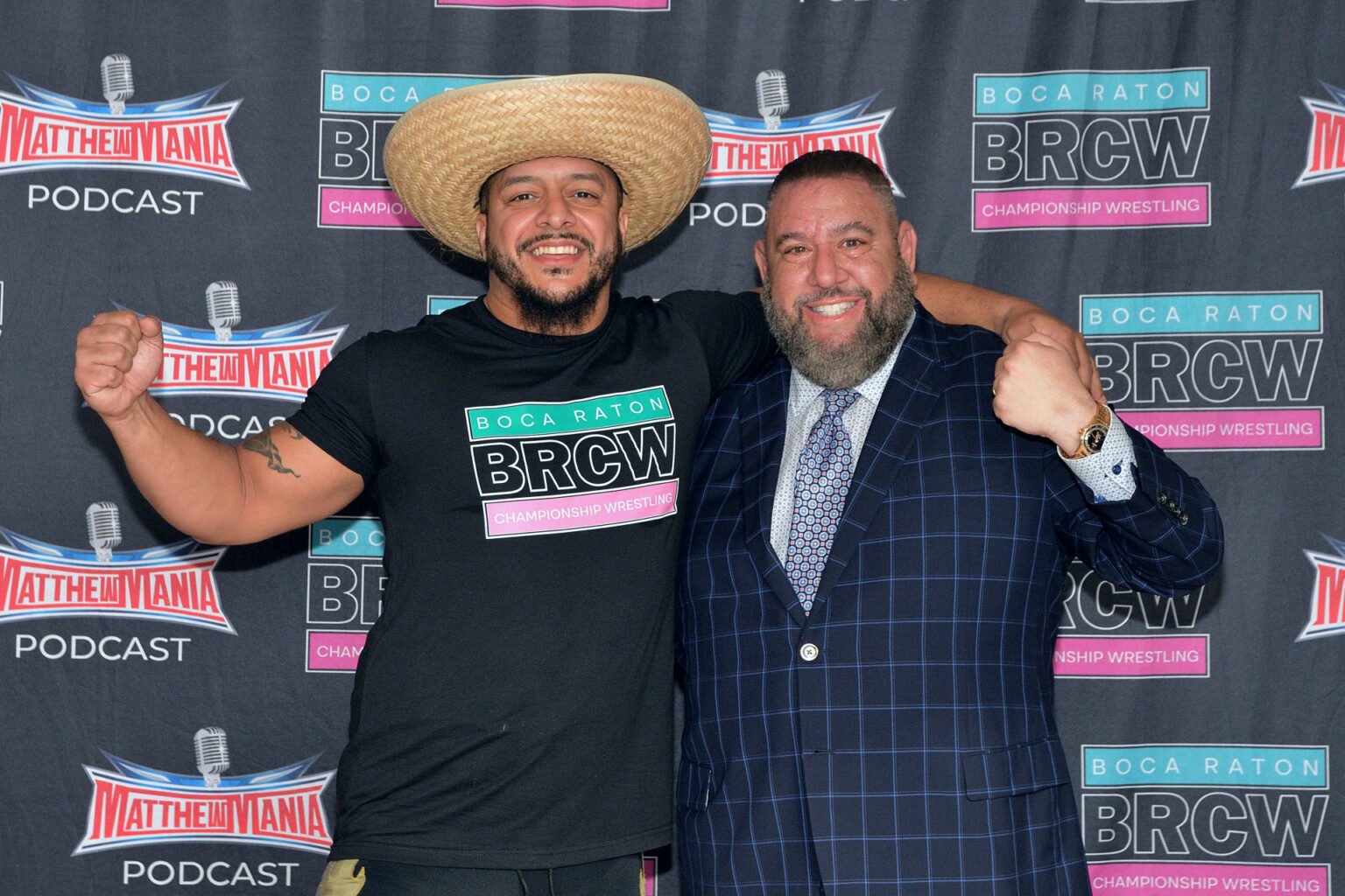
Boca Raton Championship Wrestling (BRCW) introduced a new company logo during WrestleMania Week in Las Vegas, where the promotion held its debut event, ‘BRCW Vegas Vacation.’
The redesign reflects a branding update as the South Florida–based promotion expands its presence beyond its home market. According to company officials, the new logo is intended to reflect both the promotion’s existing identity and its broader ambitions within the professional wrestling industry.
“This is more than just a logo, it’s the next chapter of BRCW,” said Executive Vice President Neil Glazier, describing the change as part of the company’s growth beyond Boca Raton.
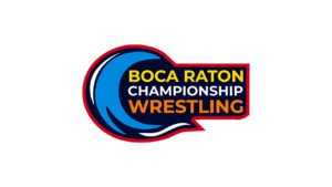
Since its founding, BRCW has used multiple visual identities. Its original logo featured a stylized design influenced by Coastal Championship Wrestling and incorporated a Miami-inspired pink and blue color scheme. A later redesign introduced additional symbolic elements, including an ocean wave and a raised fist, alongside brighter primary colors.
Owner and CEO Matthew H. Maschler said the second logo did not achieve the level of recognition the company had anticipated.
“When we decided to continue BRCW, we invested in a completely custom logo that really meant something,” Maschler said. “But the truth is, BRCW is evolving, so we felt the logo should follow suit.”
The newly introduced logo is a revised version of the promotion’s earlier branding, retaining elements associated with its initial identity. The introduction took place during WrestleMania Week, a period when multiple wrestling promotions host events and related programming in the same city.
BRCW also presented the updated branding at WrestleLit as part of its outreach during the week’s activities.
Maschler said the new design reflects the company’s past and future direction.